
A personal identity built around bold expression, structure, and recognisable form.
This project explores how a distinctive visual language — through colour, typography and mark-making — can create a brand that is both flexible and immediately identifiable. The application focuses on simplicity, allowing the mark and colour to carry the identity.

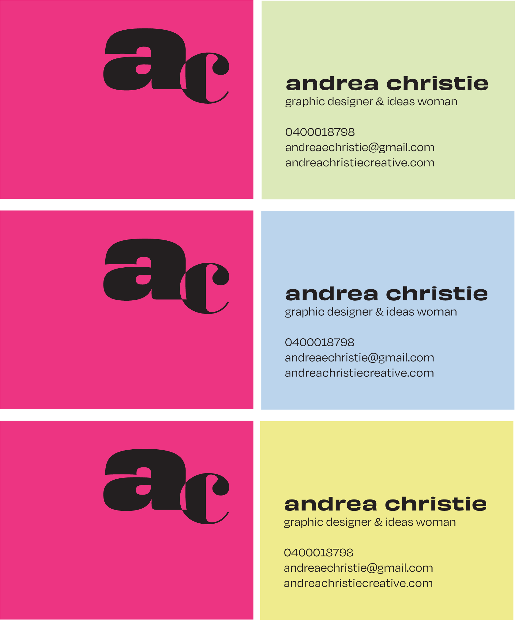
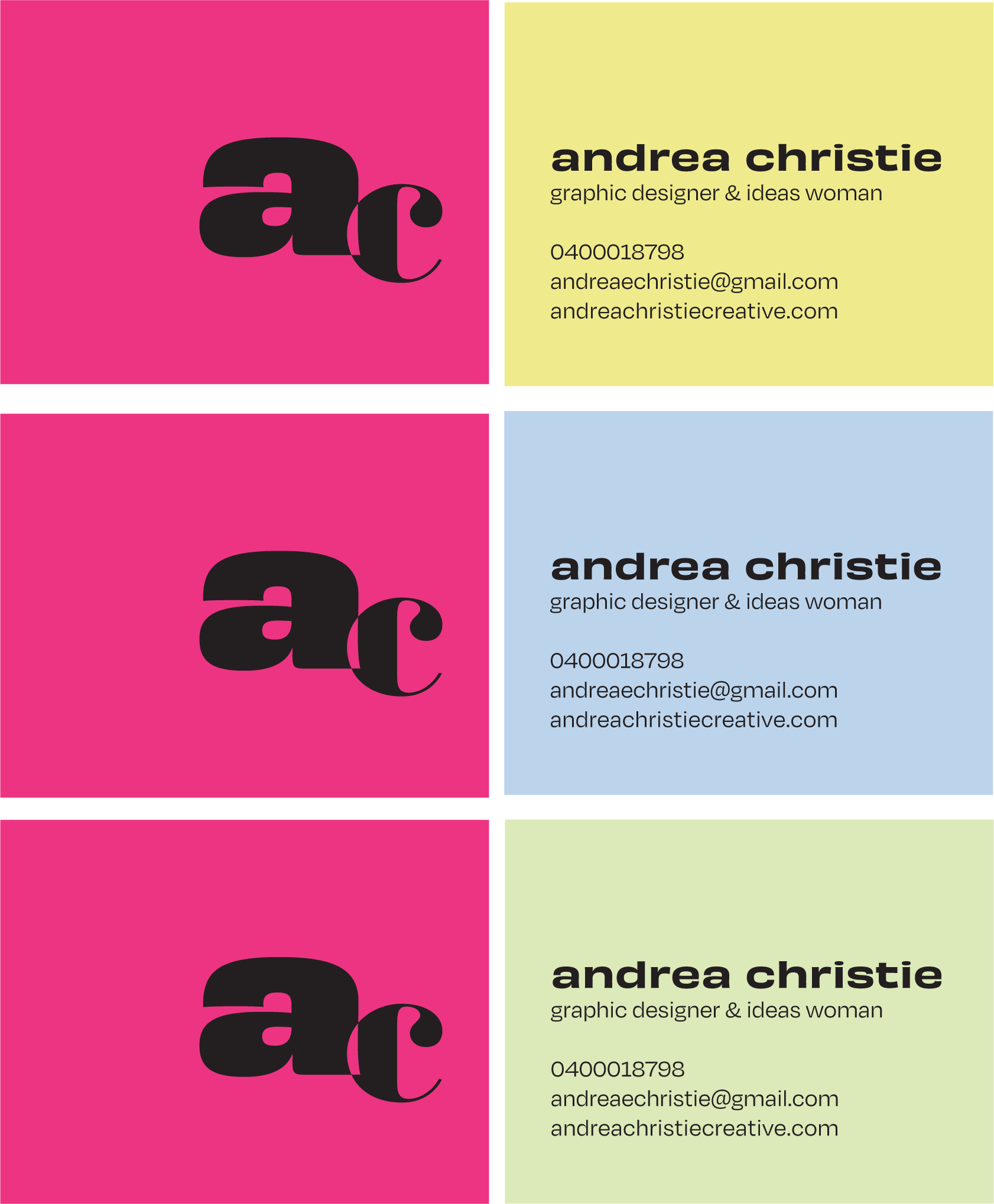
Final application balances bold colour with a restrained layout, allowing the identity to remain flexible while staying immediately recognisable.
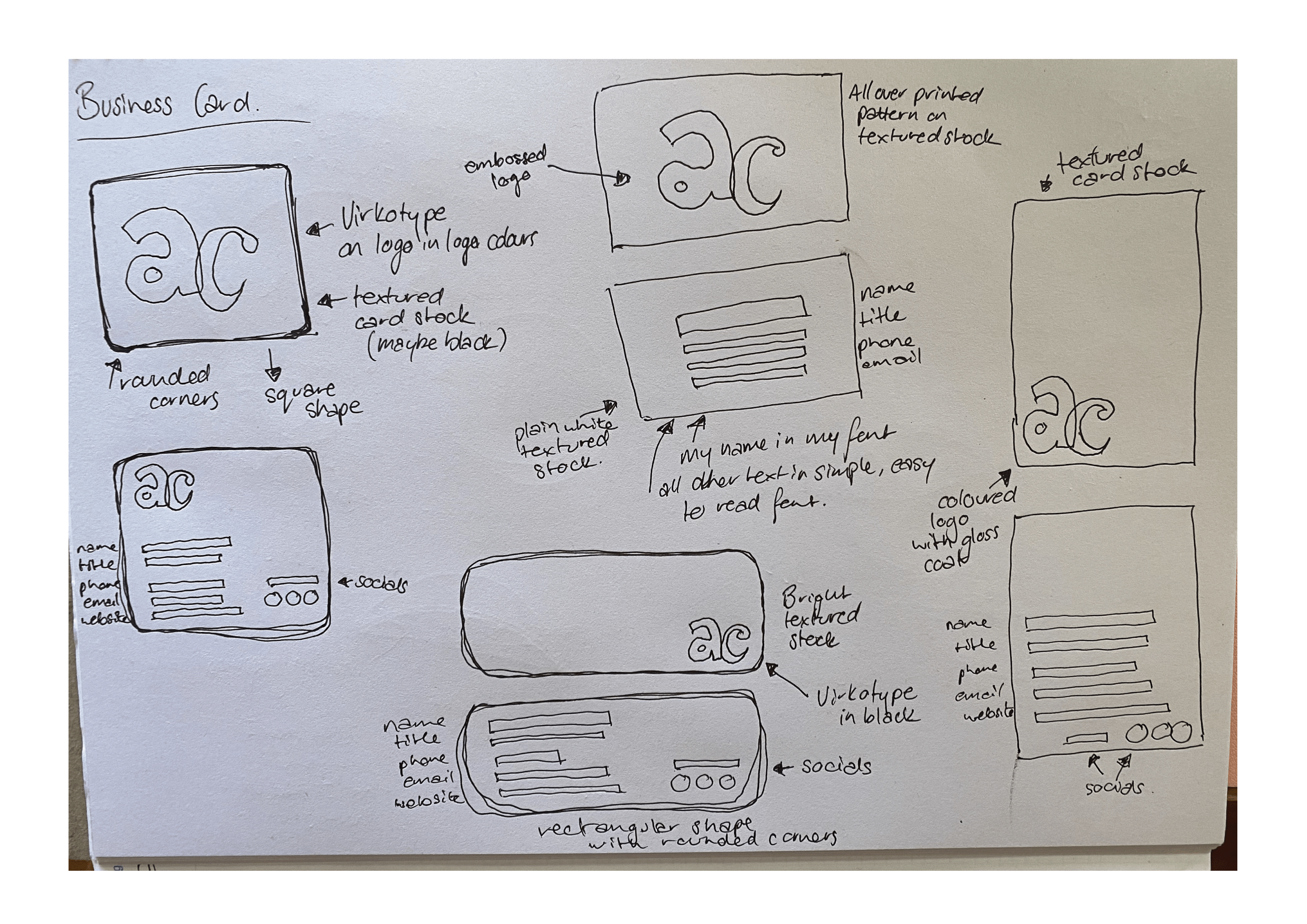
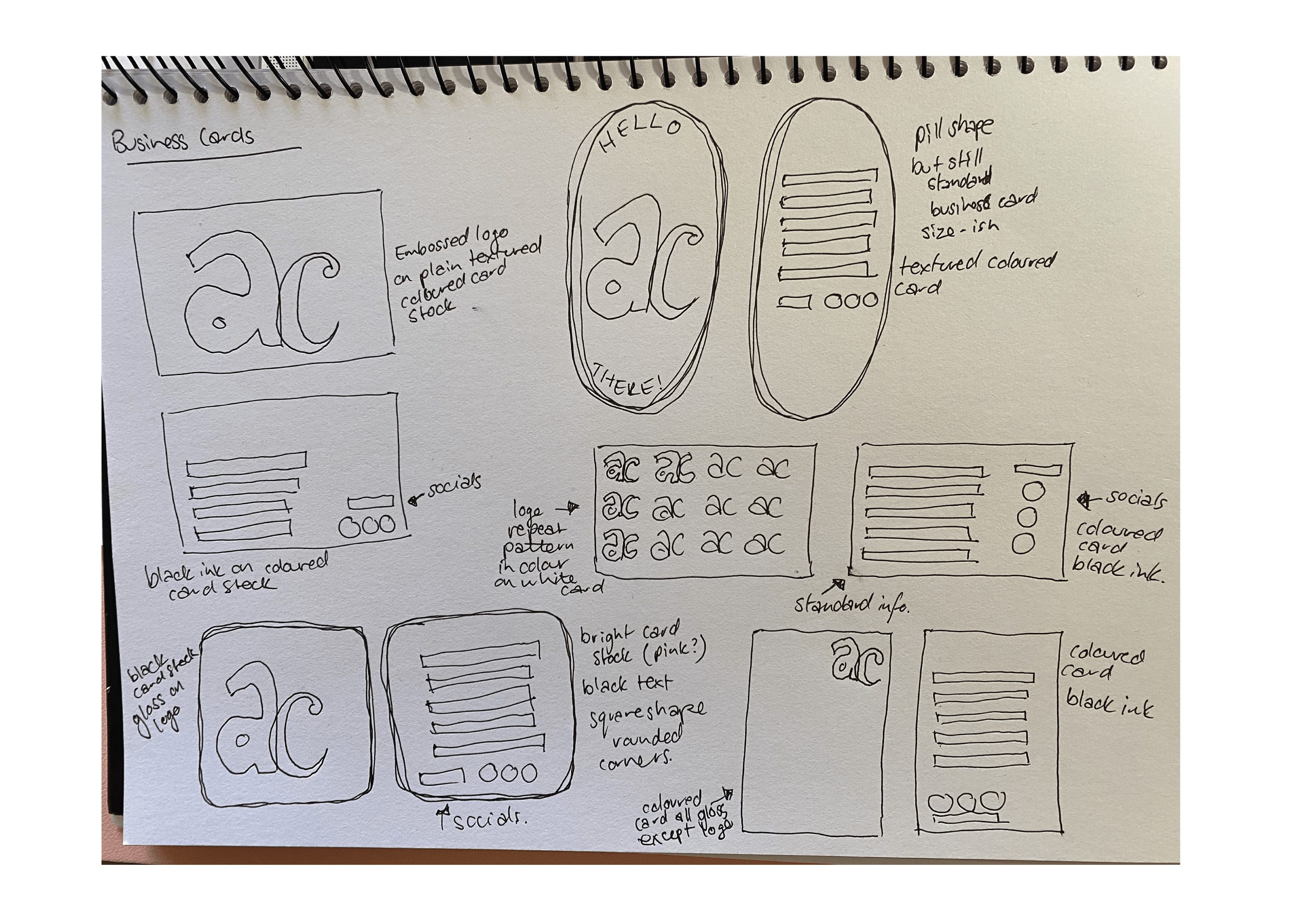
The top-right layout was selected for its clearer hierarchy and improved balance. Contrasting Colorplan stocks introduce variation, while black ink grounds the system, ensuring consistency across applications.
A tactile extension of the brand
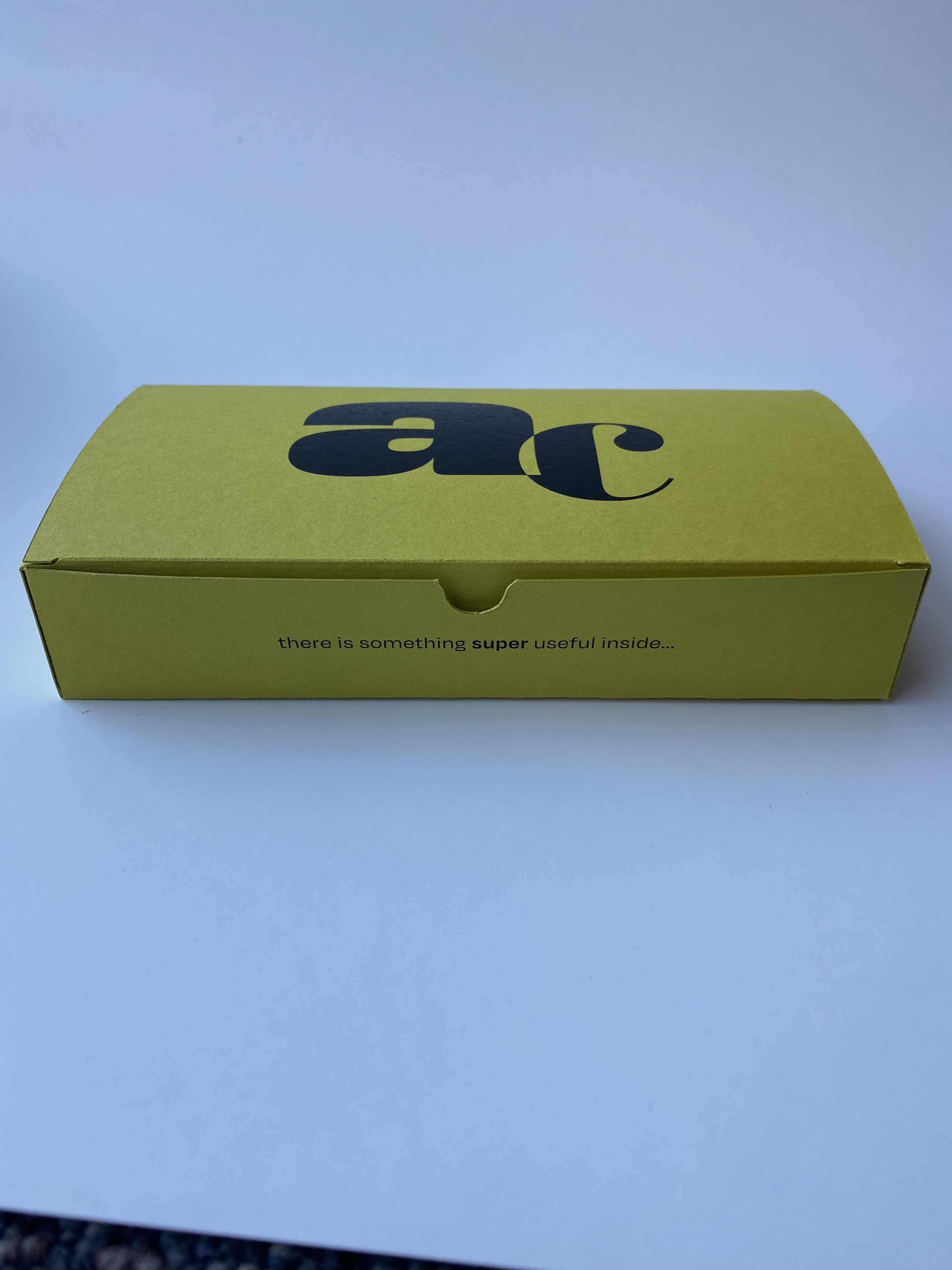
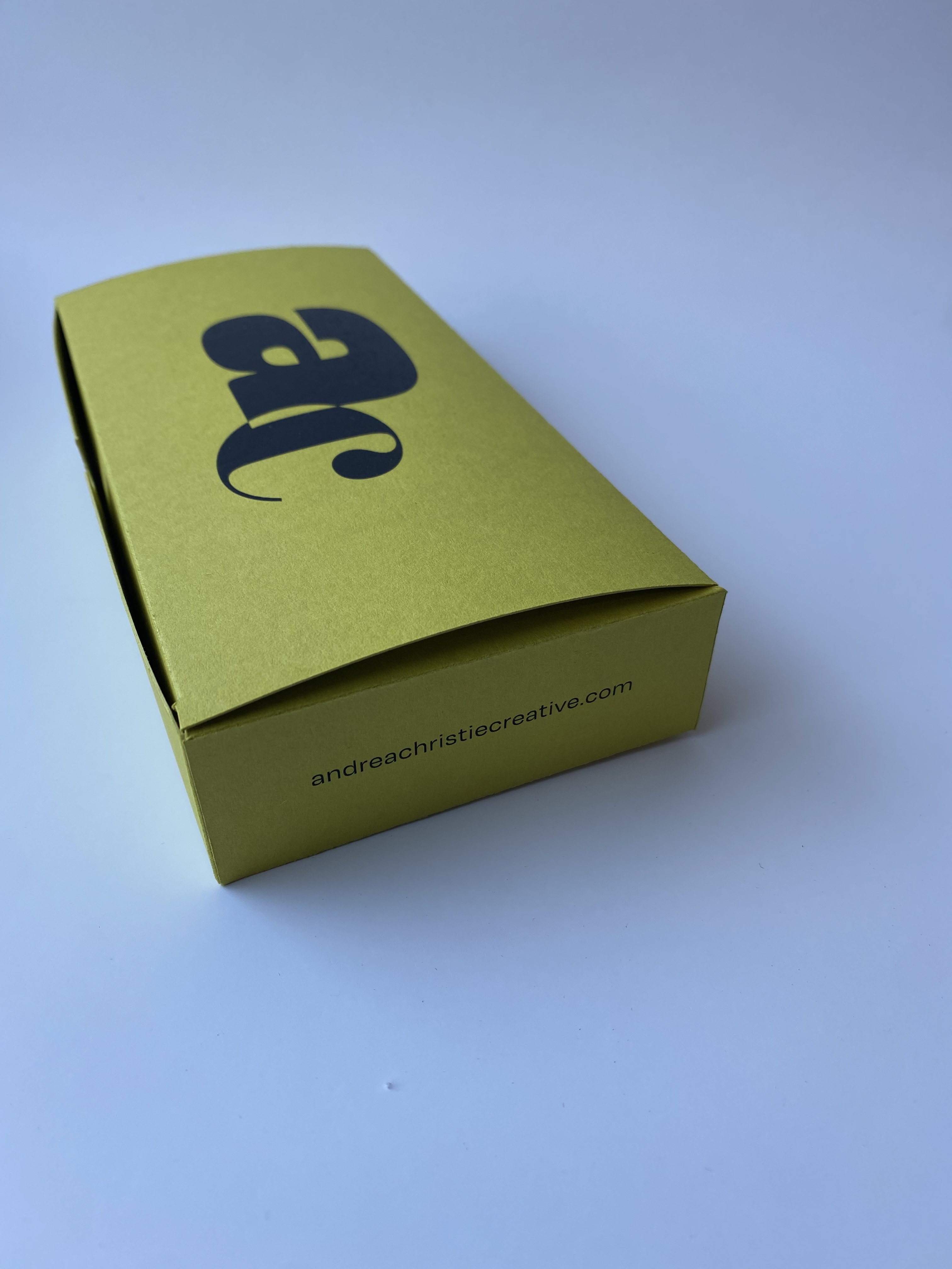
To create something memorable and physical, the identity extends into a promotional tea towel and packaging set.
The tea towel features a recipe for Lemon Melting Moments, providing a functional base for the concept. Hand-drawn lemon and blossom illustrations were digitised and carried across both the tea towel and packaging, creating a cohesive and recognisable visual language.
Inspired by a personal reference point — a biscuit that became a small but consistent ritual during my studies — the concept introduces a subtle narrative layer to the brand.
The experience continues through the packaging, where bold colour, typography and considered details are revealed through interaction.


The identity extends into a digital environment through this portfolio website, designed to be clear, considered and easy to navigate.
A minimal layout keeps the focus on the work and process, while a motion-led landing experience introduces the brand through colour, pattern and movement.
