
My aim was to create a cohesive personal brand that encapsulates me and my design style. When looking at creating my logo, I knew I wanted to incorporate how I write my lowercase ‘a’s, as not many people write them like I do. I also knew I would use bold colours, but I wanted the logo to be recognisable regardless of the colours I used, knowing I would want to mix it up in the future.
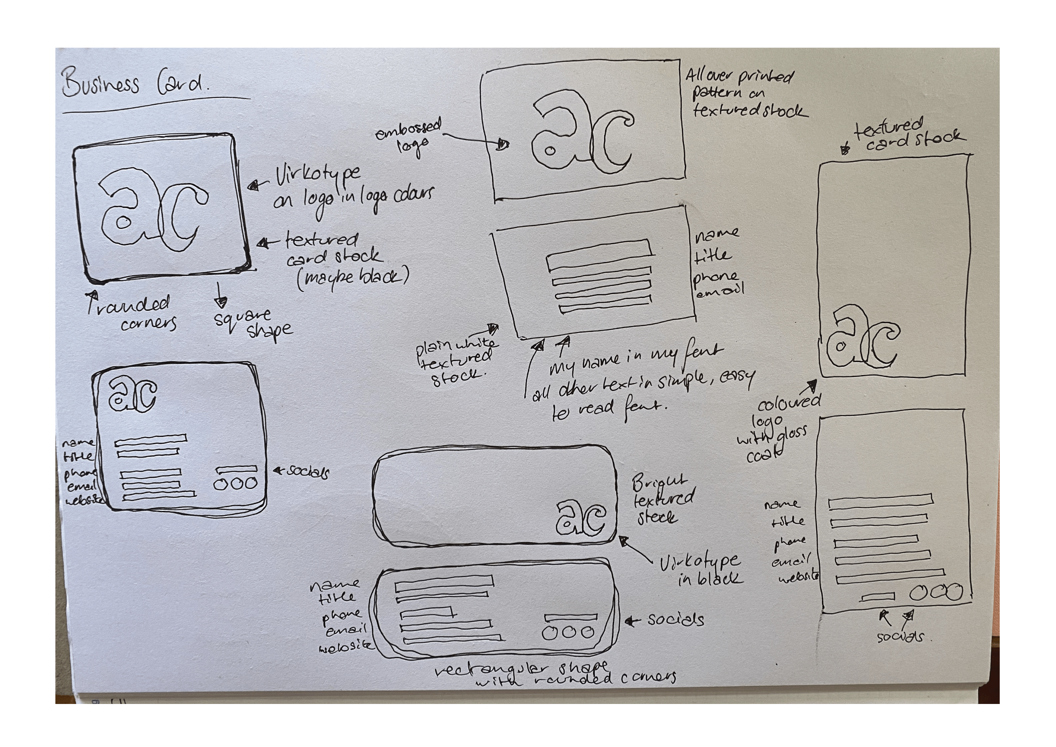
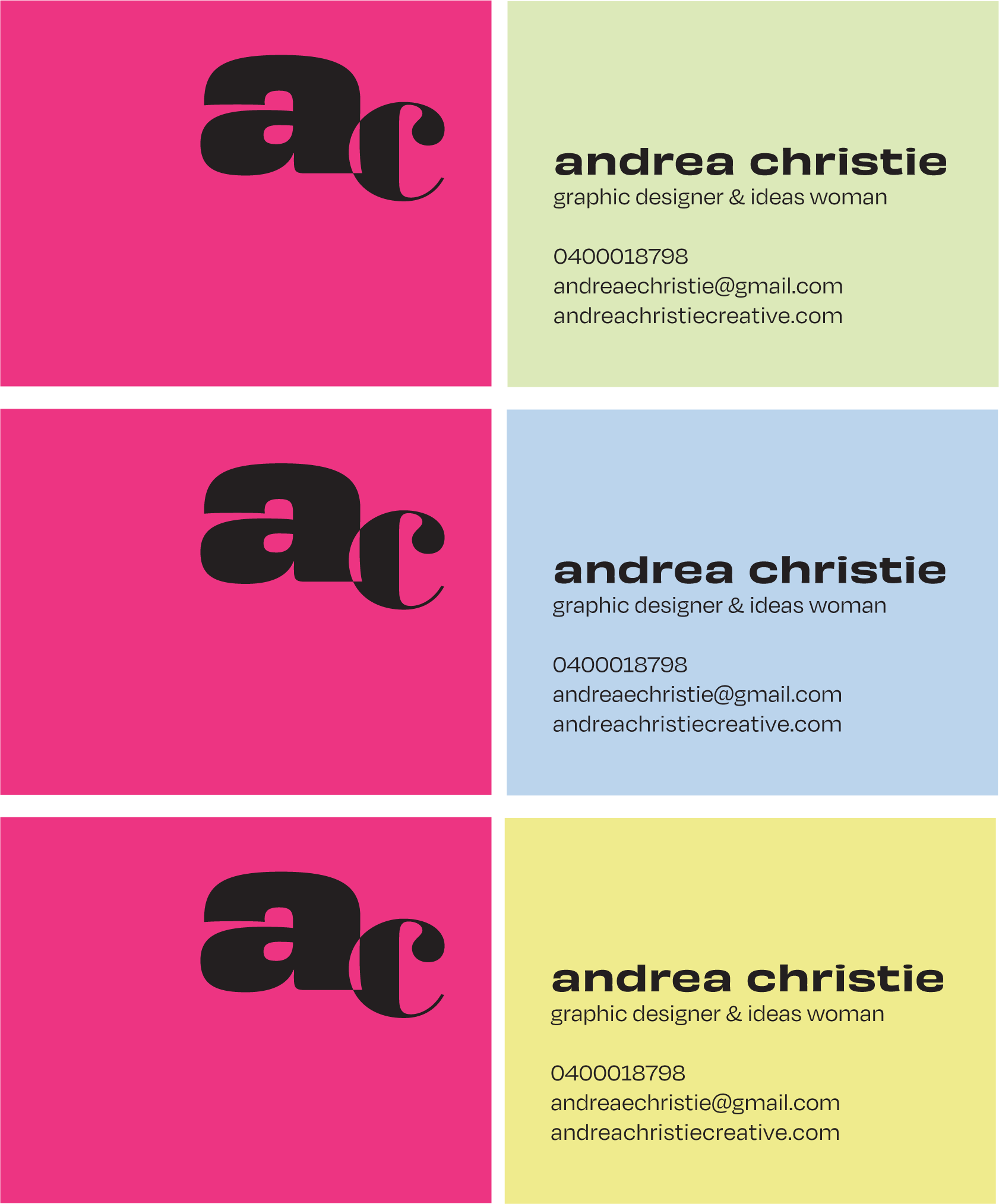
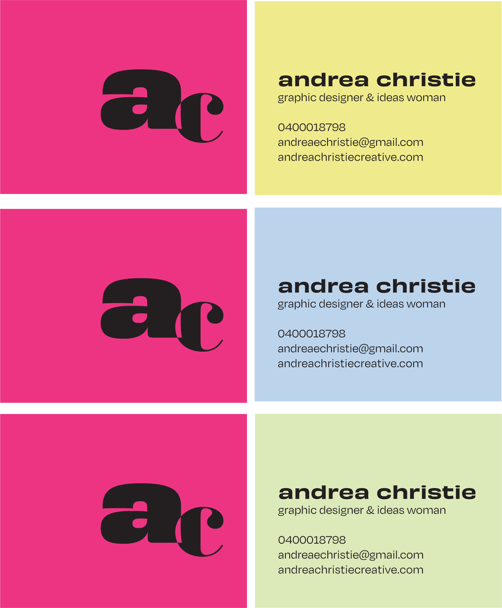
When working on my business card, I wanted to keep it simple. Letting my bold logo stand on its own and using a beautiful coloured card to be the main attraction. I did quite a few iterations, trying to work out the perfect business card layout that expressed me in a simple way.
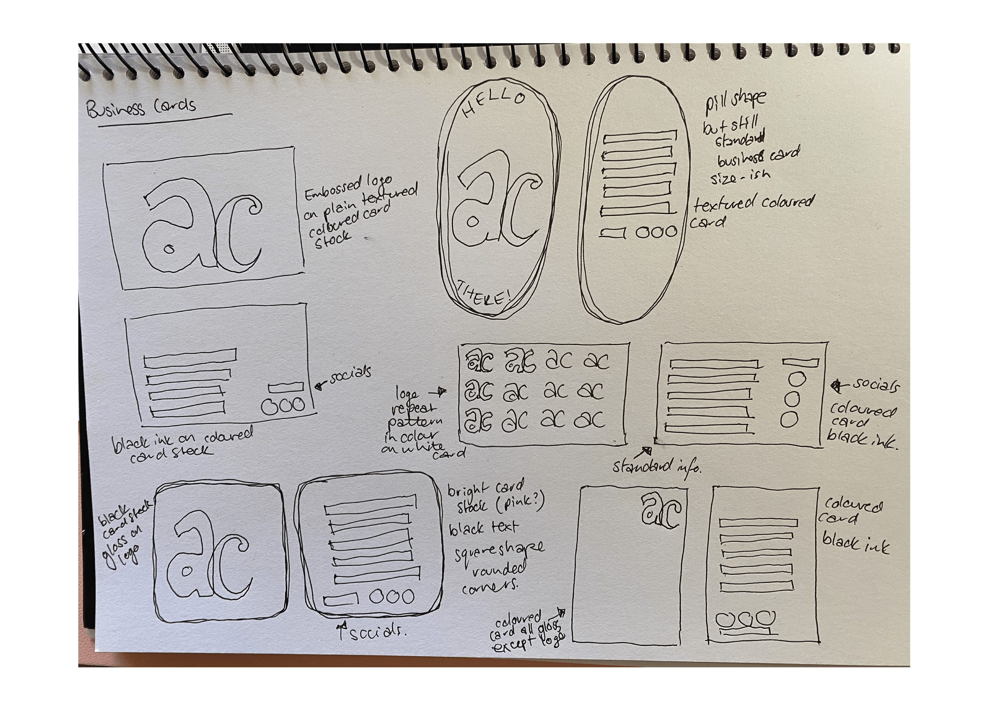

These were the final two front iterations I was left with, firmly set on Hot Pink Colorplan from Ball and Doggett for the front, while still deciding on a complimentary colour for the back. I ended up choosing the front layout on the right, and for the back, I went with Colorplan Chartreuse. The two coloured cards will be duplexed together and I am keeping the rest simple with black ink.
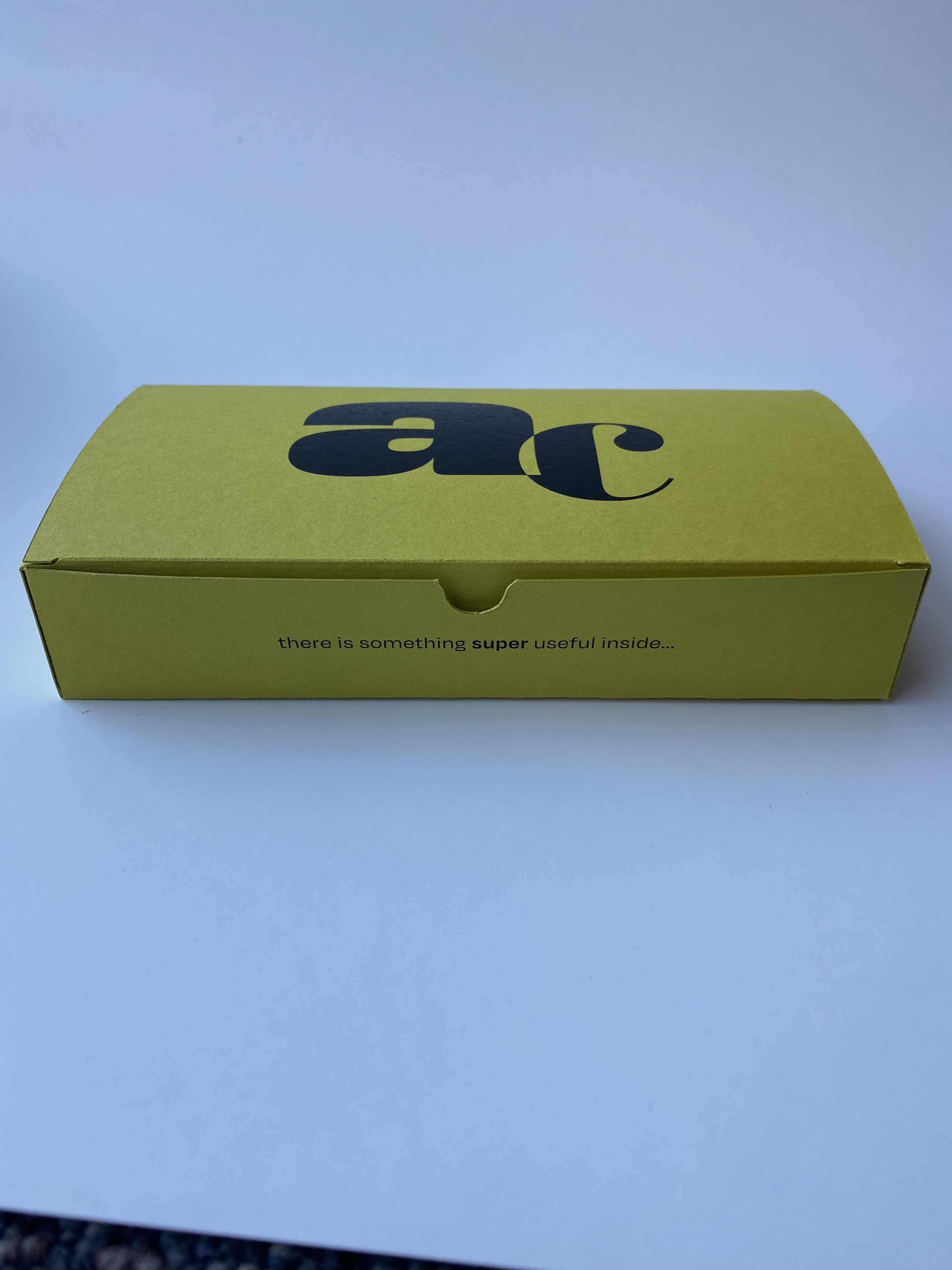
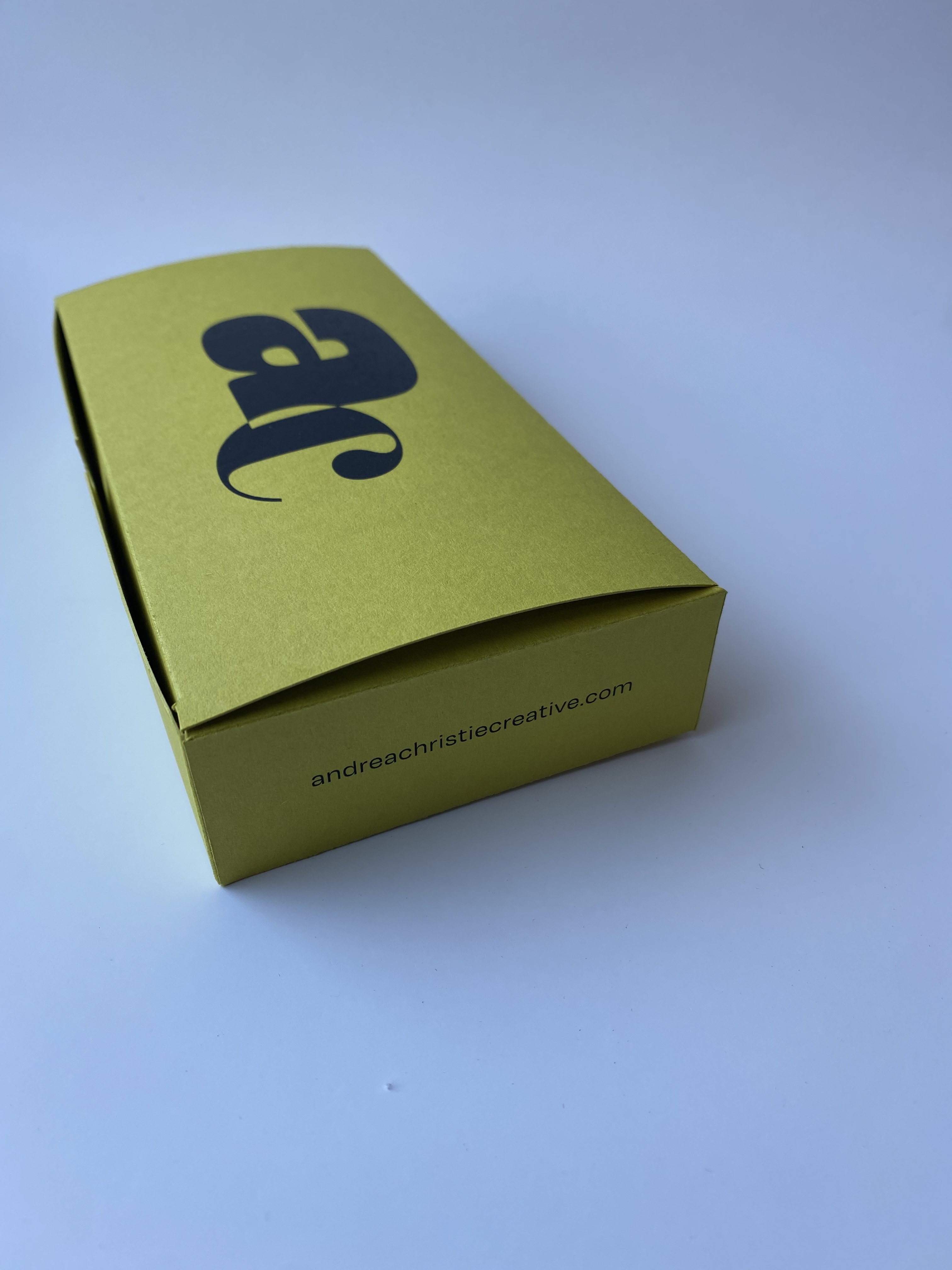
To compliment my branding and to create something memorable to give to potential employers, I created a promotional tea towel and box. The tea towel is a recipe for Lemon Melting Moments, a biscuit that has literally supported me through my studies. I have hand drawn some lemons and blossoms and then digitised them, to use around the border of the tea towel. For the box, I wanted to reinforce my brand, so I used my logo on the top and the same Colorplan Chartreuse card as my business card. I included my website, care instructions for the tea towel and the fact that it was all designed and made by me. On the inside of the box top flap, is a mini resume, with more fun information about me. On the bottom of the box is more lemon and blossom illustrations, that match the exact illustrations on the tea towel that you see when you open the box.


In addition to the business card, the box and the promotional tea towel, I created this portfolio website. Again, I tried to keep it simple, with the focus being on the work in my portfolio and the processes I took to get the end result. I created a motion graphic for my landing page that showcases my logo as well as my surface pattern designs and my love of colour.
