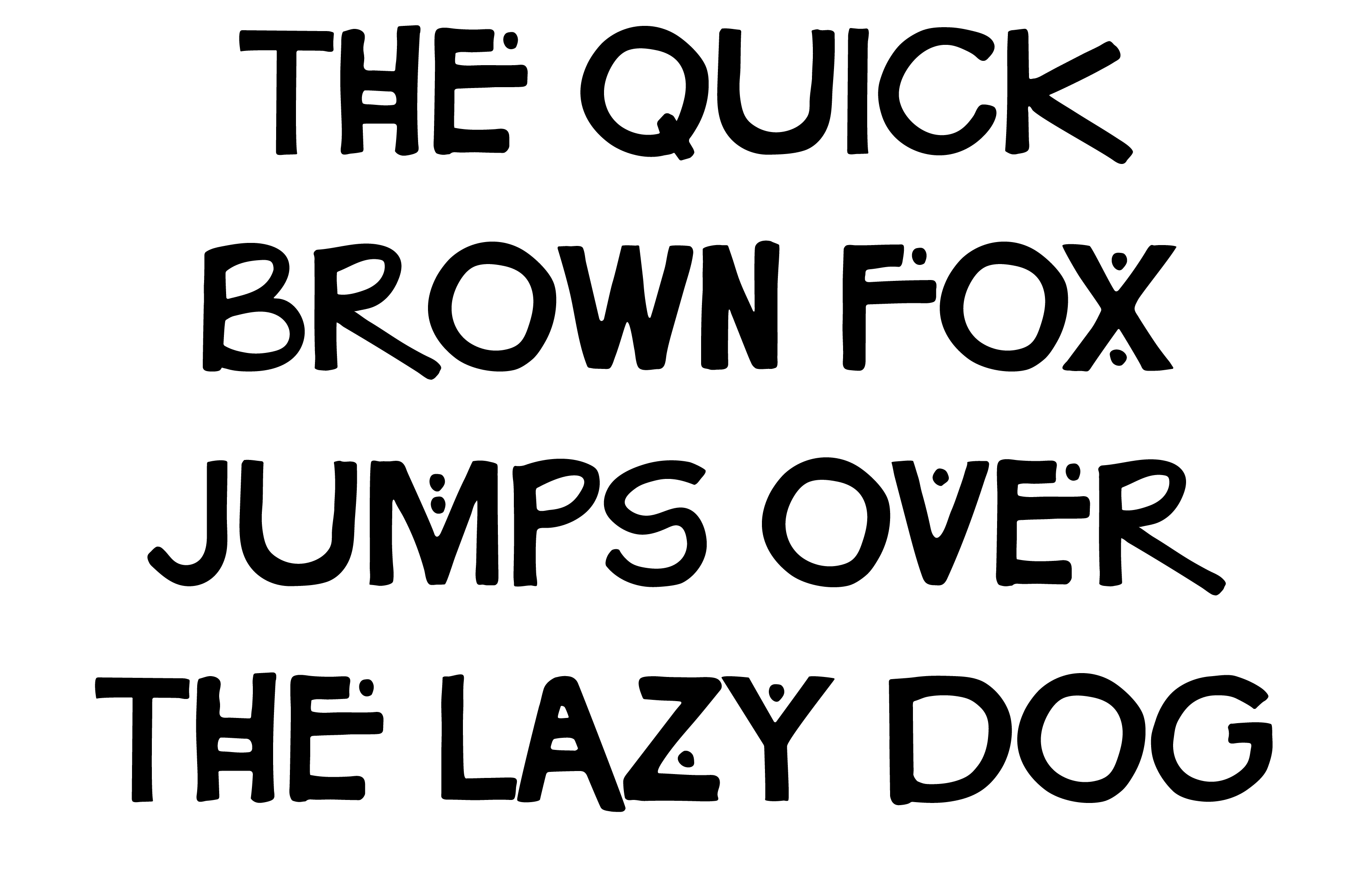
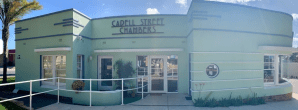
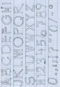
One half of this project was to create our own typeface, after collecting inspiration from wherever we could find it, and use it as informal type layered over our formal type setting. My typeface was inspired by a sign inside a travel agent that had been done by hand and the lettering on the outside of a building on the Goolwa main street. (Inspiration pictures below)
The other part of this project was to use research into a respected architect to inform a 3D-type form creation, the final design needed to reflect the style and the ethos of the architect, form and/or materials they used. The photographed letterform is to form one side of an A2 poster, and the other side is a combination of formal and informal type, consisting of the initial research into the architect and a typeface created from scratch.
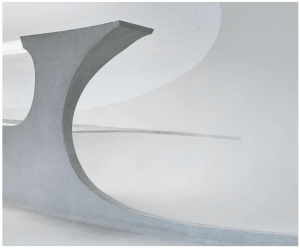
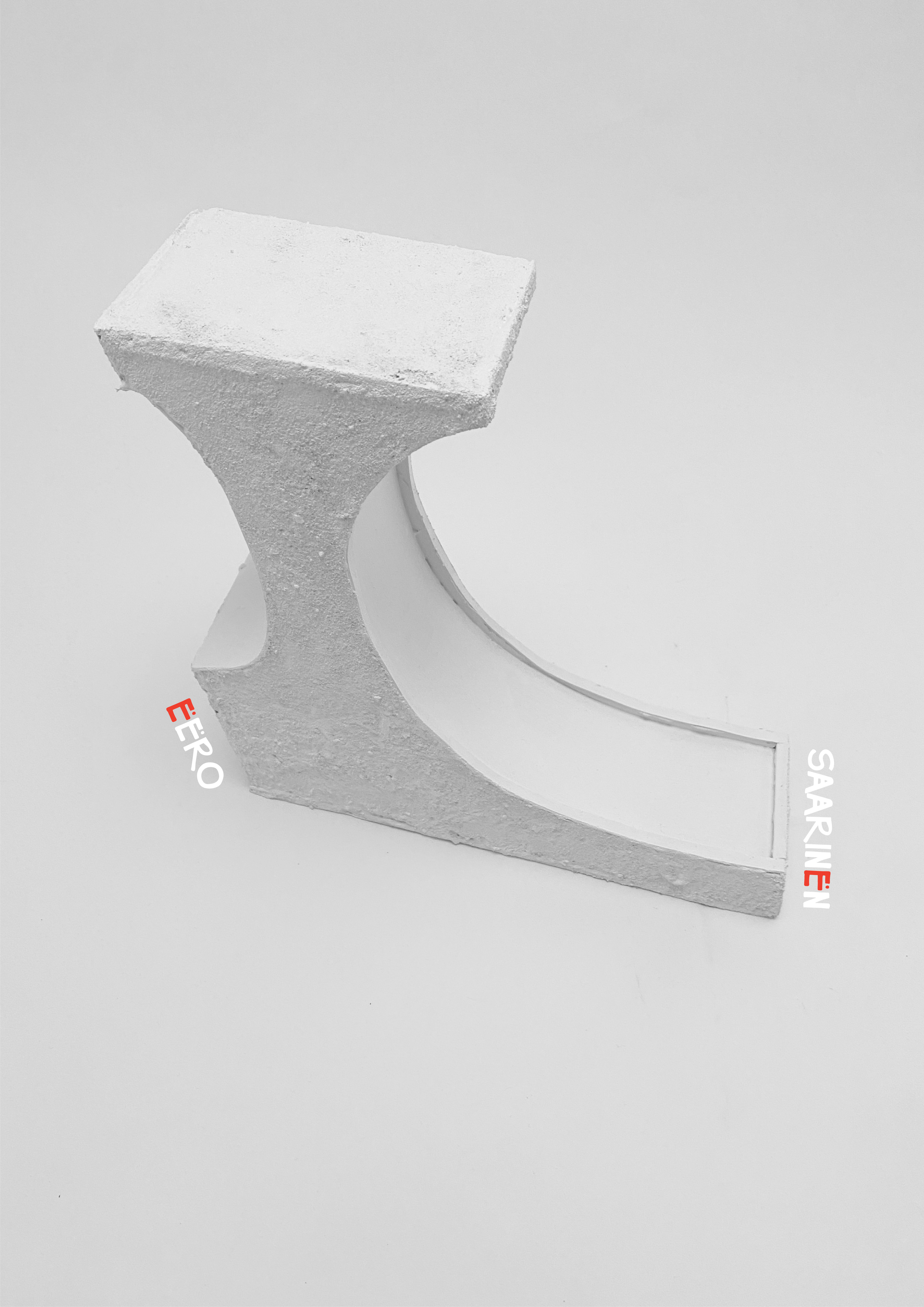
My chosen designer was Eero Saarinen. I was blown away by the TWA Building, the construction and the thought behind all of the details was next level. I could have chosen a number of different letterforms from pictures of the TWA building, but I went with L, after seeing the service desks and the beautiful lines they created. (Inspiration pictures below)