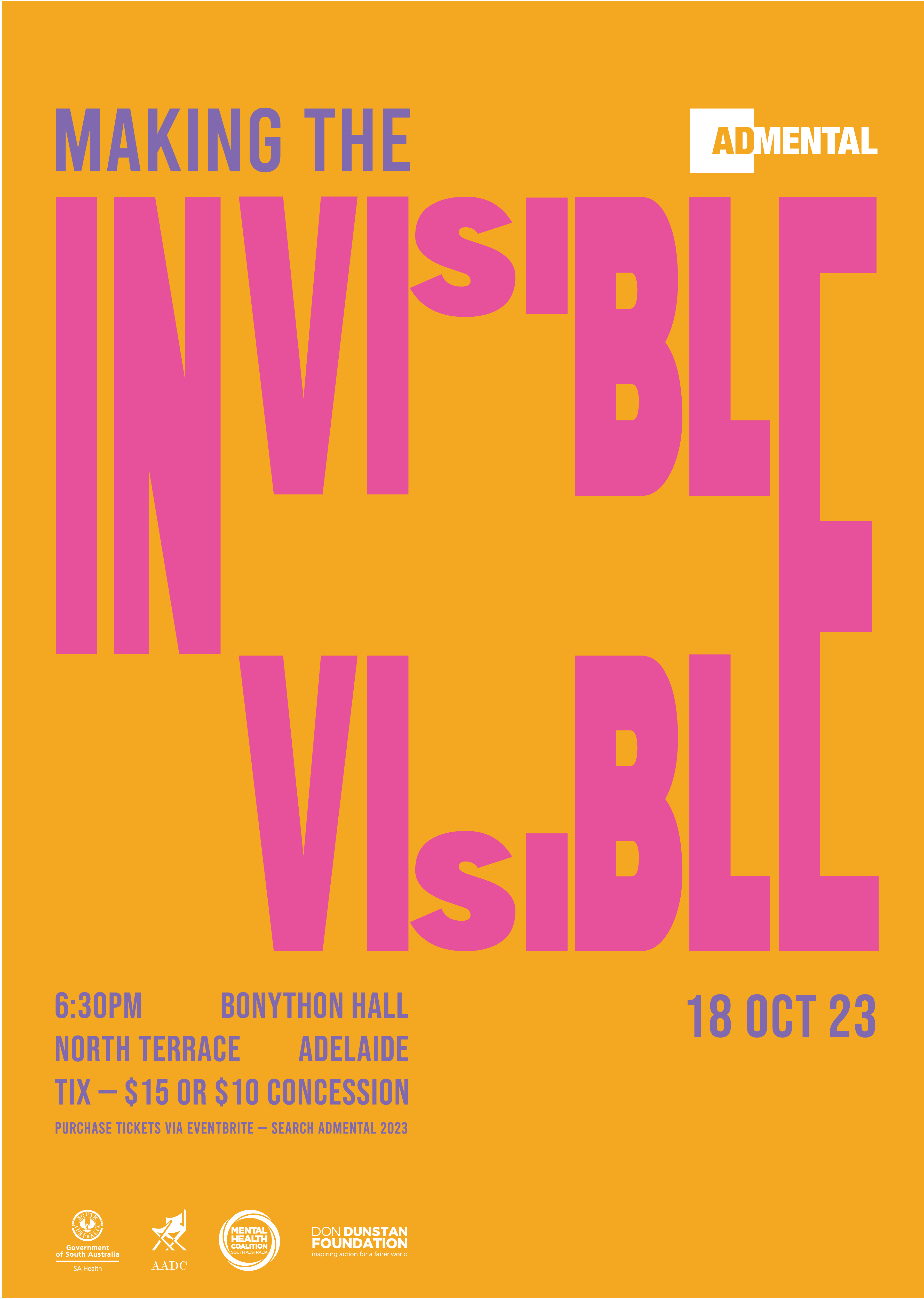
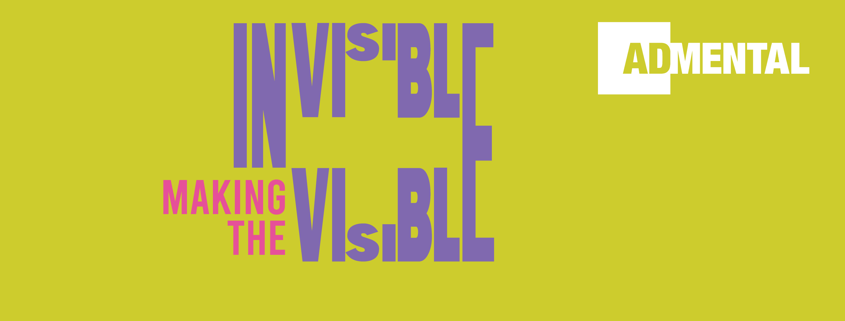
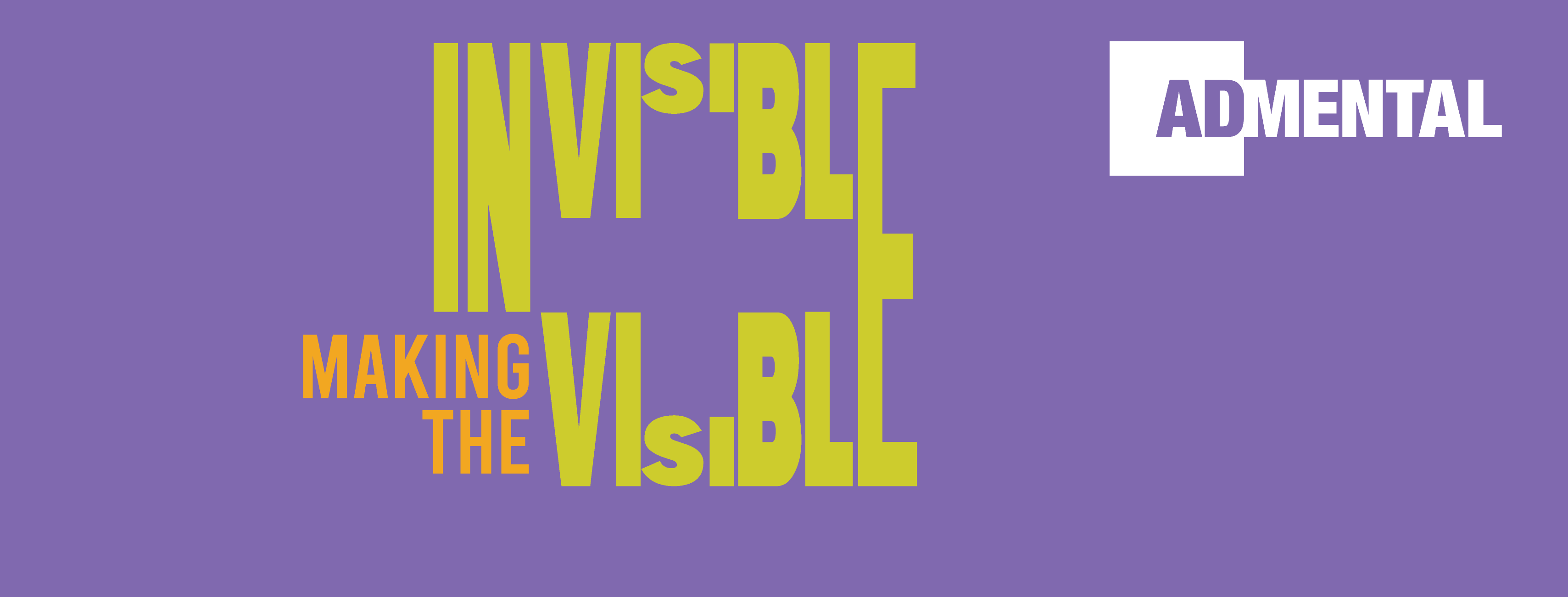
AdMental, which started in 2017, is an entertaining event harnessing the power of marketing and advertising to help grow our collective understanding of mental health and wellbeing. To attract as many people to the event as possible, we were asked to design an A3 poster and a Facebook banner. The poster should be engaging and positive, steering away from dark colours, and greys and showing mental health in a dark way. It should be eye-catching and relatable. The banner should talk back to the poster but does not need to contain all the information from the poster.

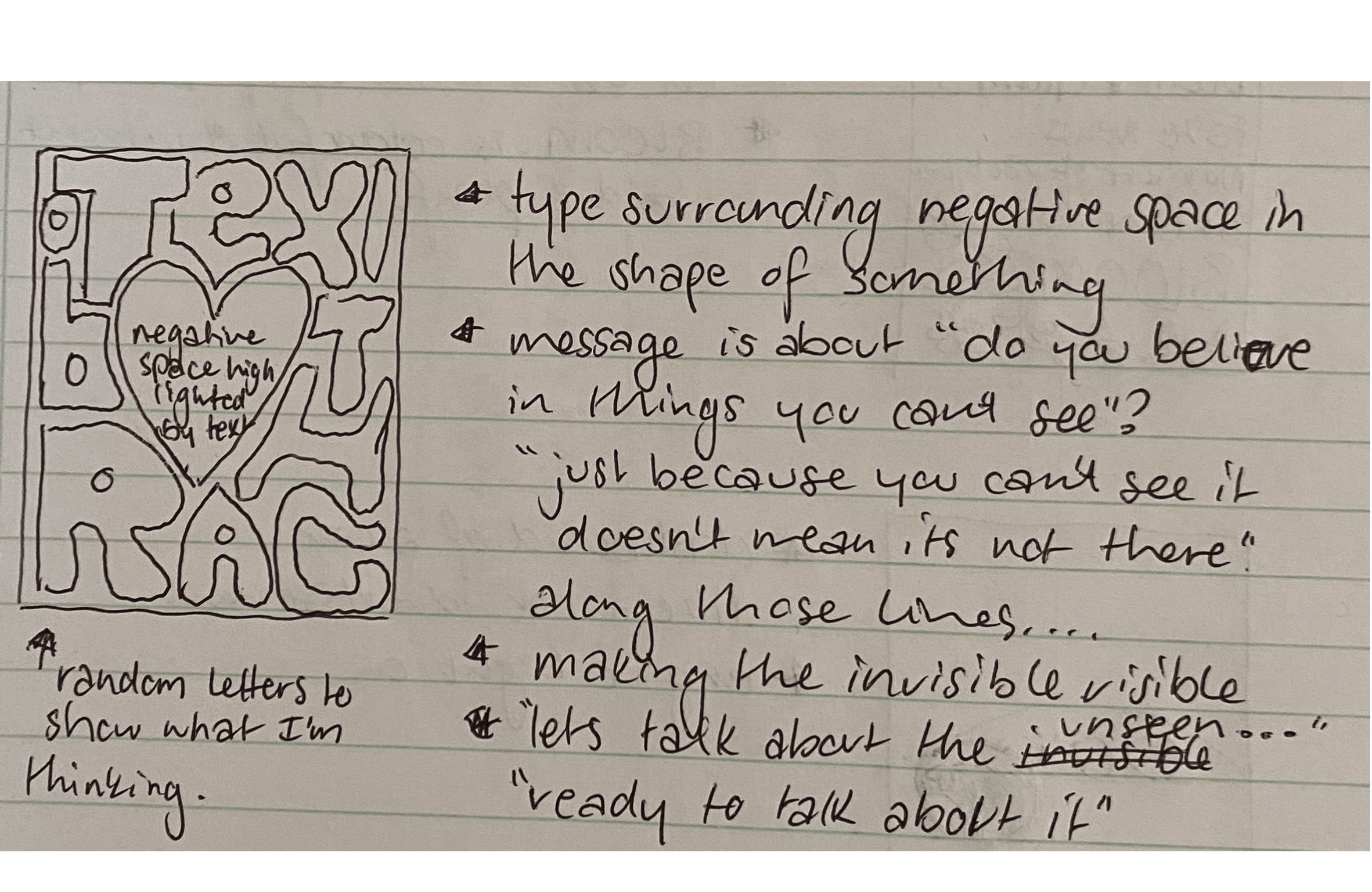
The above idea was the one I got the best feedback on, despite it not being fully formed. I spent a lot of time researching and refining to work out exactly what my message would be and what the typography would highlight in the negative space. In the end, I came up with a positive (plus) sign, highlighting the event’s positive angle on mental health as well as the internationally recognised symbol for health. The message ‘Making the invisible visible’ is what both advertising and AdMental do, so it seemed very fitting to use that as my tagline. To fit the brief for an eye-catching design, I chose a colour palette consisting of pink, orange, purple and green. When it came down to choosing one colour combination, I felt like they all fit the brief and all gave the bright, bold, positive feeling the client wanted.


I really liked how the posters looked displayed together, and I felt like it would be a disruptive way of capturing the viewer’s eye and their curiosity about the event, and hopefully turn that curiosity into attendance.


I kept my Facebook banner simple, allowing the colour and typography to capture the viewer, making sure to leave room for the circle profile image that sits at the bottom left of the banner, so none of the typography was covered.


